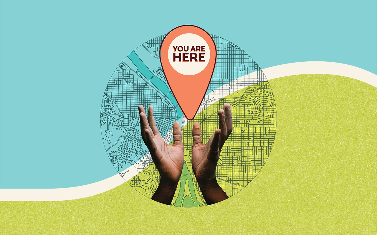
You Are Here
I’ve been searching for my bearings these past several months. It’s been hard to know what comes next — how to respond to a world shifting under our feet and how to chart the path forward.
Then it struck me: it’s like standing in front of a map. The kind you see in airports or malls that serve to orient you to your surroundings.
The first thing I always look for is that little marker: “You are here.”
In this moment of collective disorientation, I ask, “Where am I?”
I am in the town I chose to raise my children. While I’ve lived on every coast of this country — East, West, Gulf and North (and yes, Lake Michigan counts as its own coast) — Portland, Oregon is the place that has held me through many seasons of remarkable change.
I am in a city where people step up to lead with vision and action — working together to shape what’s possible. I am in a neighborhood where I proudly send my kids to public schools just down the street from our home. I am in a community where we take care of each other; where a newcomer can find community, no matter their pronouns. I am in a state bursting with people determined to do good, to stir up good trouble — so much so that Oregon is among the states with the highest number of nonprofits per capita.
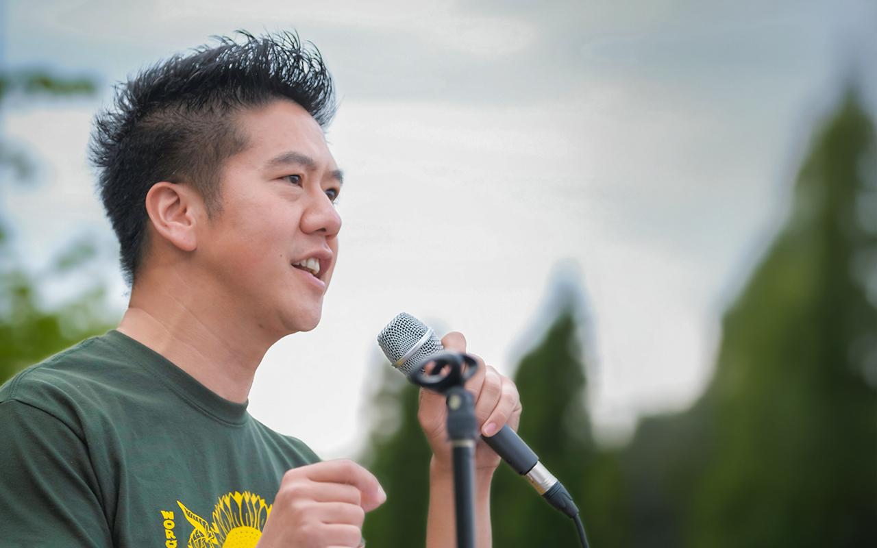
On Sunday, I joined thousands running Portland’s half marathon — winding through neighborhoods, cheered on by strangers, even passing the ICE facility that has been a symbol of division. What I found instead was a city still showing up for itself.
So, here I am. Here we are. Grounded. Rooted. Ready for whatever comes next.
Building a United Front
Today, “what comes next” feels especially urgent. Recent federal actions threaten the freedom of foundations like ours to give in alignment with our missions and strip away the freedom of communities to chart their own futures.
We are proud to join with more than 100 of our peers in philanthropy who have signed on to the Unite in Advance statement supporting our freedom to give in the face of growing governmental threats and actions.
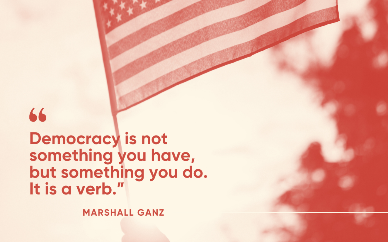
In this moment, we also know our responsibility is to stand firmly with Oregon’s nonprofit leaders who safeguard democracy and protect the safety and dignity of our neighbors.
Meyer leadership and staff are in active conversations and collaboration across Oregon, as well as across the country. While we are not ready to speak on all that is happening right now, I want to acknowledge and appreciate that these growing coalitions are working hard on defensive and proactive actions that will help keep funders and our nonprofit partners safe and in business.
Community safety is especially important at this time, so I want to share that Meyer will be doubling our commitment to the SAFE (Security, Action, and Freedom for Everyone) Fund at Borealis Philanthropy.
SAFE provides urgent, flexible support so organizations can defend their people and their missions. These funds strengthen legal defense, enhance cybersecurity, improve physical safety and meet emergency needs — equipping grassroots leaders across Oregon to withstand attacks and continue their vital work in disability justice, reproductive rights, racial justice, trans rights, immigrant justice and more. In the last three weeks, the fund has received dozens of applications from across the state, representing both our metro and rural communities.
Moving Toward Justice, Resilience
A map doesn’t just tell you where you are. It reminds you where you’re headed.
Here we are: in Oregon, together, in a moment that demands courage. And here is where we are going: toward resilience, toward justice, toward a future that cannot be dictated by fear, but by care, solidarity and the determination of people who refuse to be moved from their rightful place on the map.
We are here. And we will move forward — together.