Every day since January, Matt Kinshella has created an illustration depicting something he’s grateful for, from Italian architecture to Mexican hot sauce to a baby that sleeps through the night.
Equity Is About Resources: Matt Kinshella, (he/him), placed third in the 2016 Equity Illustrated design contest sponsored by Meyer Memorial Trust and Northwest Health Foundation.
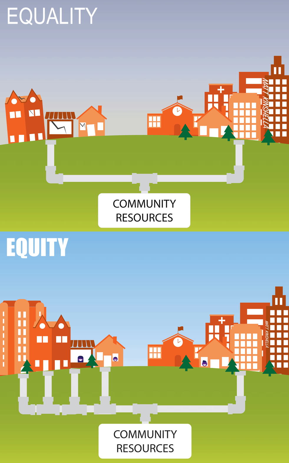
The exercise hones the San Diego native’s graphic artistry. Spurred by an interest in illustration as a method of social change — and explored during his 3 a.m. wake-ups with his newborn — Matt decided to enter the Equity Illustrated contest in January with an animated GIF showing how inadequate resources separate equality from equity.
“You see it driving around Portland, which has a national reputation as this place where young people come to retire, where it’s all about food carts and stuff. But there are so many barriers in the Portland that isn’t on the national radar,” Matt says. “We all get to learn and have more enrichment when these barriers in business, in our neighborhoods and in schools are removed.”
The two-frame illustration focuses on deep structural, systemic and historical disparities between some communities. It placed third in the Equity Illustrated design contest sponsored by Meyer Memorial Trust and Northwest Health Foundation.
Matt’s own equity journey began after settling in Portland in 2008. Over the next six years, he worked for 211Info, a Meyer grantee, and at the Chalkboard Project, an initiative of Foundations for a Better Oregon, a collaboration of six Oregon foundations, including The Collins Foundation, Ford Family Foundation, Oregon Community Foundation, JELD-WEN Foundation, The James F. and Marion L. Miller Foundation and Meyer Memorial Trust.
Now 30, Matt is the communications director at Neighborhood Partnerships, a statewide nonprofit focused on bringing opportunity to all Oregonians through housing and financial stability initiatives and advocacy (and a Meyer grantee). Working with people from a range of backgrounds on poverty, housing and education reform opened his eyes to issues facing people from different backgrounds and income levels, he says.
“It wasn’t like I was born knowing about equity. I am really grateful and privileged to be exposed to people who get this in a deep and rich way. And I learn from them still.”
His winning equity entry reflects a clear understanding of equity.
Two frames, two communities. On the first frame, one community has many assets: a school, buildings, a hospital, solid housing. The other community has no school, no hospital and buildings in disrepair. A pipeline delivers equal resources to both. This is equality — and it’s not working, Matt says.
The second frame shows the two communities receiving resources that meet their needs. Now the two communities thrive. Equity, in a word.
“Bottom line, people should not have less opportunity because of the color of their skin or the ZIP code where they are born.”
Check out more of Matt’s designs from his yearlong project to illustrate something he’s grateful for every day in 2016 (#365gratefulillustrations) on Instagram, @mkinshella.
If you're seeking permission to use Matt's equity illustration, please email Meyer communications: communications [at] mmt.org (communications[at]mmt[dot]org) or Matt directly: mkinshella [at] gmail.com (mkinshella[at]gmail[dot]com).

A PDF version of Matt’s winning illustration is available here.

