We interrupt your regularly scheduled programming to talk about Drupal 8, the tool we used to build this website. What on earth is a tech article doing on Meyer's site? Well, we believe in openness and knowledge sharing, including on the tech side.
When we built our last Drupal site, we shared the full recipe of all the modules and themes we used, and it was quite popular. We planned to do this again with this site, but developing on the Drupal 8 bleeding edge meant using early solutions rather than the best ones, making that less useful or even misleading. We still want to share knowledge, and I decided to focus on an oft neglected area, namely admin modules. Here are some useful modules that site owners and maintainers love having but all too often don't get.
Modules I think should always be in a site
Pathauto

This module automatically generates URL/path aliases for content (nodes, taxonomy terms, users). It builds the URL from the title so that you don't have to manually type it, including leaving out noise words such as and and the (configurable). It also follows rules you set up that help you make URLs more descriptive, for example automatically adding the /news/ part of this article's URL. You can see how closely this page's URL aligns with this article's title. This allows you to have URL aliases such as /news/amazing-news instead of ugly ones such as /node/123, and it removes hassle and human error from other approaches. A usable site really can't do without this module, and this one is usually included in new sites.
The image shows an example taken from the edit screen of this article.
Metatag
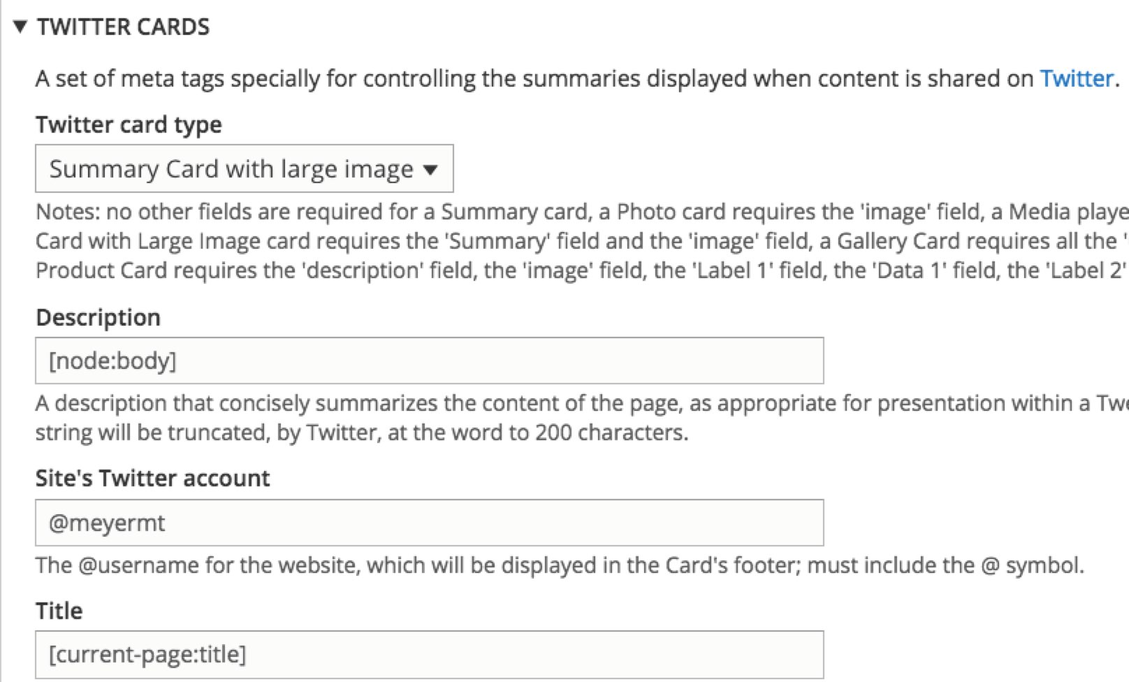
This module lets you automatically provide structured metadata, aka "meta tags," about a website, which helps with SEO. It also helps you to control how shared content appears on social media (e.g. by using Open Graph Protocol for Facebook and Twitter Cards for Twitter) by letting you configure how your content should be interpreted by those services, including drilling down by content type if needed. This module is a tad cumbersome because of all it lets you do and it could use some better default values, but it is vital if you care about search engine ranking and social media control and therefore it is regularly included in new sites.
The image shows an example of the Metatag options for Twitter as associated with a particular content type, namely news articles.
Redirect
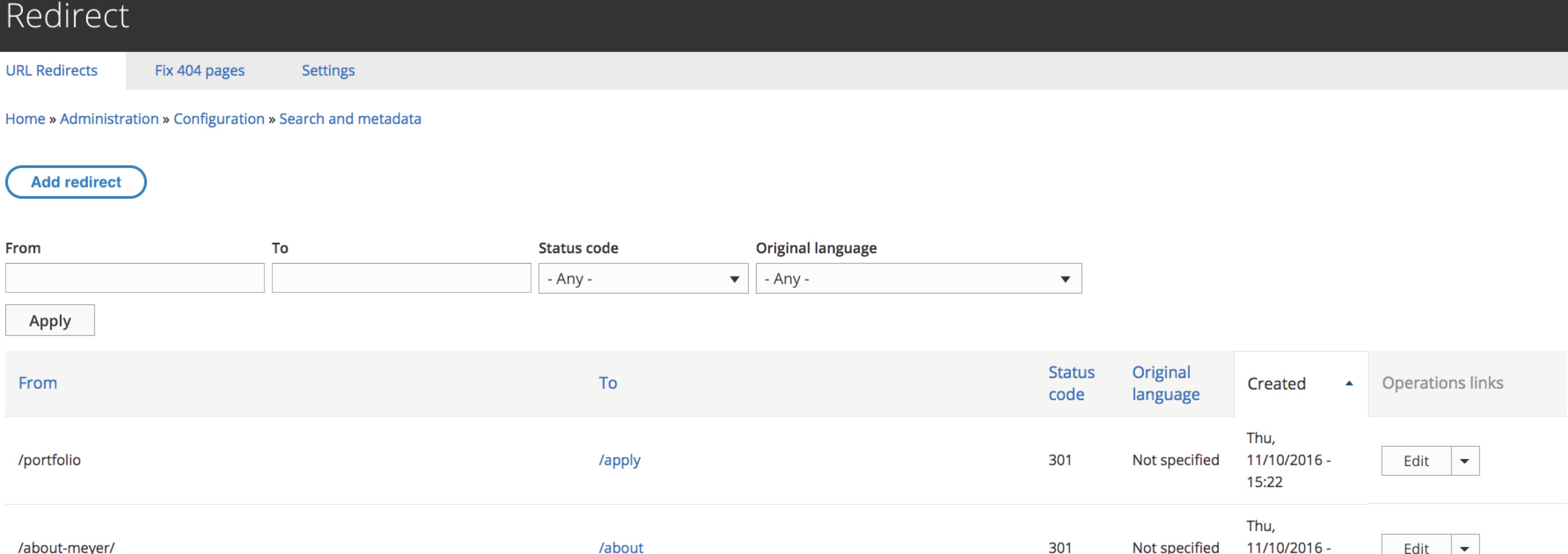
I've yet to receive a site or be involved in a vendor-built site that was delivered with a module like this one installed and that baffles me. It lets you add redirects for incorrect URLs (e.g. I've added a redirect to fix issues caused by a newsletter URL typo) and for an aliased URL (e.g. redirect common URL guesses/mistakes to the intended page). It removes case errors, tracks redirect usage and errors, helps you easily fix 404 errors and helps in a number of other ways with reducing URL noise, which in turn helps with SEO, efficiency, errors and more. Alternatives to this module usually require risky .htaccesss changes or, in our case, cumbersome settings file changes. This is faster, is easier to maintain, gives you some awesome power and flexibility, has plenty of useful reporting and is doing so much for you out of the box that I think it is a must have, particularly since it is also the D8 successor to the awesome Global Redirect module.
The image shows the main redirect admin page.
Diff
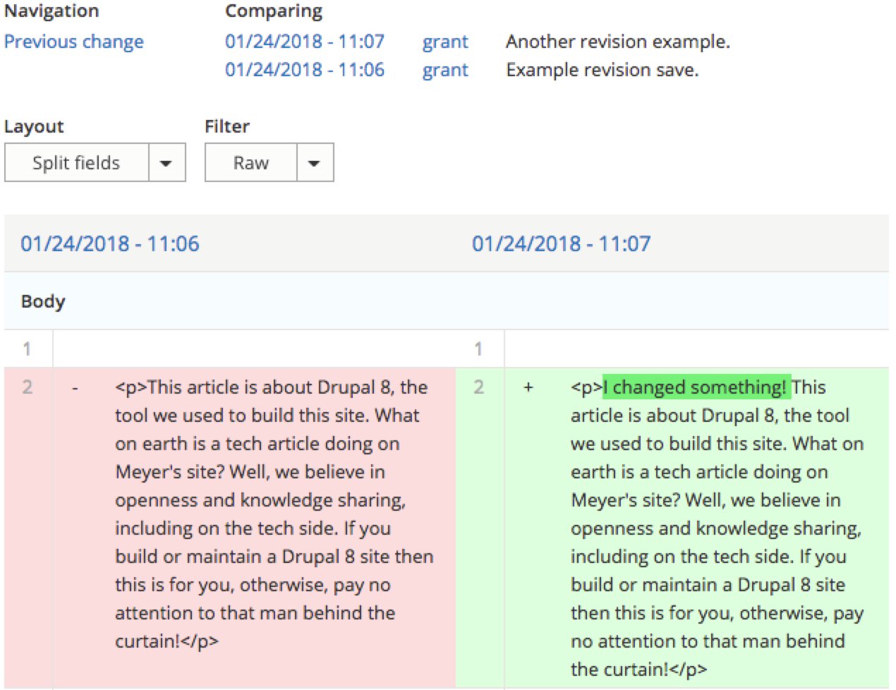
This module shows site maintainers the differences between revisions in their content revision history for any given piece of content (assuming a content type where you have revisions turned on). At the time of writing, this module was still in RC status, but it is backend only, works very well out of the box and is also configurable.
The image shows an example of revision differences for this article being highlighted.
Admin Toolbar
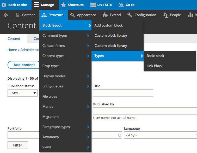
Those of you who have been patiently waiting for a D8 version, then this is the replacement you're looking for. This module improves the default Drupal administration menu at the top of your site by transforming it into a mouse-over drop-down menu, meaning much faster access to all administration pages. No more multiple clicks and page loads to get to some admin screens. It's really a must-have for modern sites. Note: Many folks use the Adminimal Theme to improve the overall administrative backend (we do), and if you do too, then you'll also need the Adminimal Admin Toolbar module to fix a number of CSS issues.
The image shows an example of menu mouse-over going three levels down. Note that the blue color is ours, not the module's (indicates production, see more about the Environment Indicator module below).
Linkit
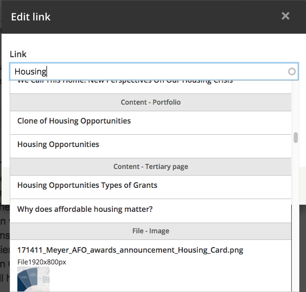
I've only just added this module to our site, and it was love at first sight for our Communicorns. Site maintainers are tired of the default method of adding links from a WYSIWYG editor, namely: open another tab, find that page, copy the URL, come back into their editor sesion and paste the URL, while also remembering to remove the domain part of the URL to ensure it's a relative link. It would be so much easier if there was a friendly interface with an autocomplete field to help you find links to content on your site — be it for a page, a file or even an image — and which saves relative links automatically. That's what this module does and why site owners love it.
The image shows an example of the Linkit popup where typing the word Housing has revealed loads of matching pages, images and files.
Quick Node Clone
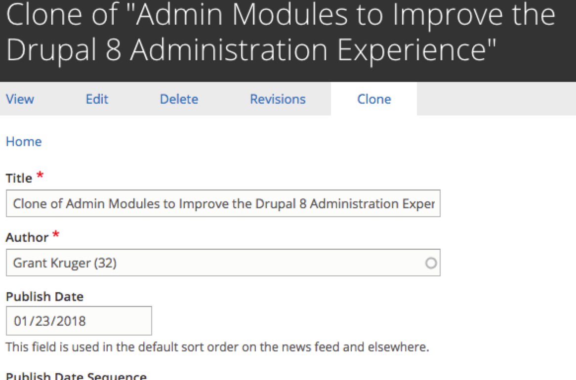
Site builders are probably more familiar with Node Clone, but the old module is currently either dead or dormant. This module was added by a team that had to rewrite it for their own D8 needs and decided to freely share their work. Thanks folks! It allows you to clone existing content, even complex content. I could clone one of our involved Portfolio pages as easily as an article. Site maintainers always want this kind of functionality, but strangely they rarely get it. And why not? They are plug and play and usually have little or no configuration. Add it and it just works.
The image shows an example of us cloning this article where you can see that all fields are being cloned.
Module Filter
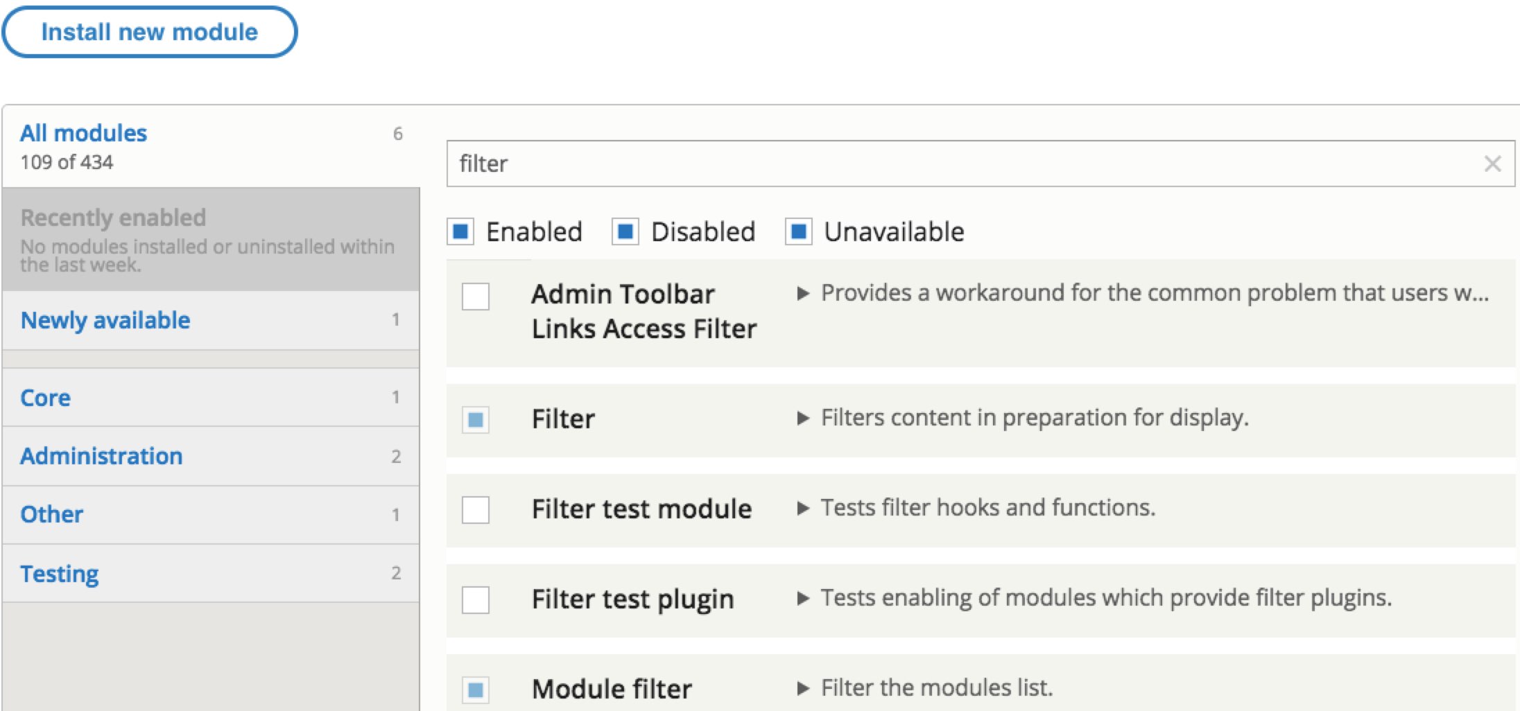
This module simplifies the ever-so-long modules page with vertical tabs and improves the search features on that page. It also adds useful search capability to the available updates page and the permissions page. This is only for site developers, but it still gives you enough UX improvement to always have it.
The image shows an example from the modules page, where you can see how the list is compressed, the search filter and options for the search. For more examples visit the Module Filter page.
Modules I think should mostly be in a site
Environment Indicator

This is a terrific module for anyone with a professional site tech workflow that includes the usual development, test and live versions of your site. Have you ever accidentally changed your live site instead of your test one or some similar mishap? It's easy to do. Our web host provides dev, test and live sites automatically, but I still want to work locally so I now have four environments to get confused between. The problem I had before was having several browser tabs open for each site as I worked on a problem, and they all looked identical and had identical favicons on the browser tabs. It was a struggle to find the tab I wanted, and then mistakes were easy to make. This module helps with cutting that down by giving you some visual cues for logged in admins about which version of your site you're on. Each environment has a different colored admin menu bar and a site name (I imaginatively named mine local, Development, Test and Live). Additionally it sets an optional overlay over the favicon in your browser tab with the first letter of whatever you named your environment and the color you specified for that environment. This helps you find the right tab quicker because when I look at my tabs I can see at a glance which environment that tab is for. Further I have a grey version of our favicon set for our admin theme so I can differentiate frontend pages from backend ones in addition to the above. This module is super helpful to devs and admins alike, really to anyone with access to more than one environment.
The image shows how my four environments are given different colors and how they appear on tabs, including having an admin favicon, plus the ability to switch between environments that reinforces the color choices (I chose not to include my localhost site as it only affects me).
Coffee
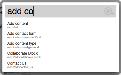
At the time of writing, this module was still in beta, but it's admin only and I have had few problems with it. I also love it to bits, and so do our Communicorns. It speeds up getting to Drupal admin screens even more than the Admin Toolbar moduleby letting you navigate between admin screens without using a mouse. You type alt and d and a popup appears with a search field, then you start typing and an autocompleter will show you all the available admin screens that match your text. You can then use arrow keys to navigate to the desired option and press enter to select it. The module allows you to include nonadmin menus too, but so far I haven't needed that. You can watch a short demo video of the Drupal 7 version of the module if you'd like to see it in action.
The image shows an example of the popup where I've typed "add co," and Coffee has shown me all the admin options that match.
File Entity Browser
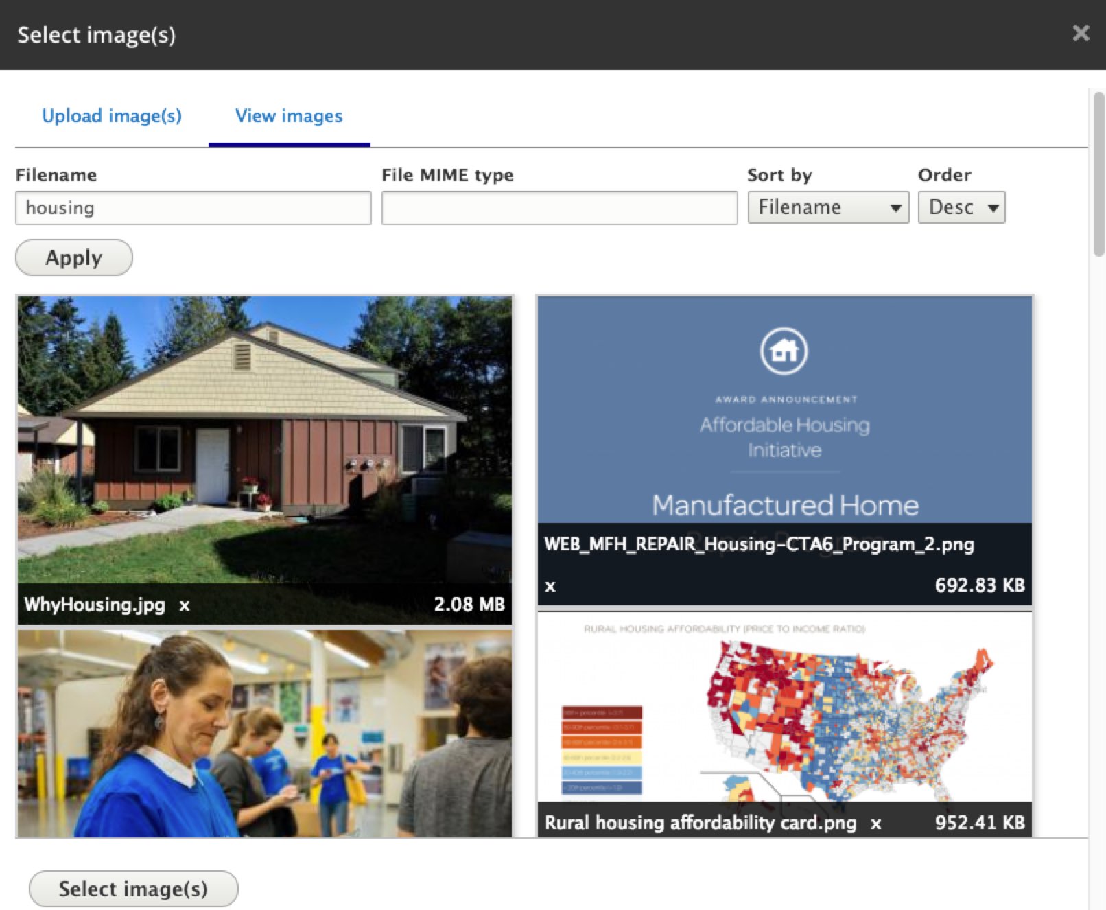
Sometimes finding files and images already uploaded to the site is a real pain. Frustrated site owners end up uploading the same image multiple times. This module lets you browse and select from your existing files using a friendly, attractive, mobile-ready interface. You can also upload new files. It makes the experience of finding a file/image so much better.
The image shows the file browser with options to restrict to files that include the word housing sorted by name.
That's it. Let me know of any notable omissions or if you have thoughts about any of the above modules.
— Grant

